Finexot.
Finexot is a modern financial management platform for Turkish accountants and SMEs — general ledger, tax returns, e-invoice, orders and multi-tenant office workspaces. We rebuilt the UI from the ground up: React 18 + Vite + Shadcn, dark and light parity, real-time data flows.
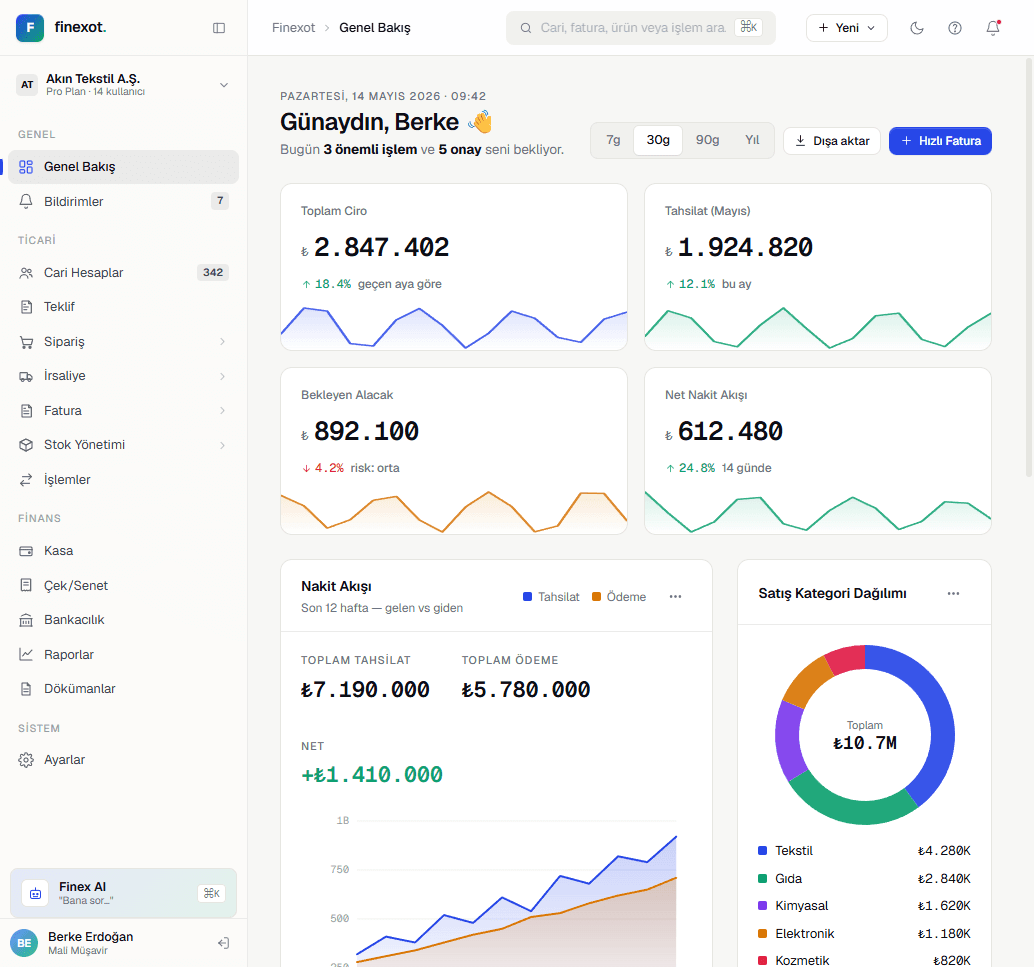
Turkish accounting software has an information-density problem: real workflows require ~40-column tables, sub-second filters, and cross-view context — but the incumbent apps solve it with grey chrome, cramped fonts and modal-inside-modal navigation.
Turkish accounting software has an information-density problem: real workflows require ~40-column tables, sub-second filters, and cross-view context — but the incumbent apps solve it with grey chrome, cramped fonts and modal-inside-modal navigation. Finexot's team wanted the density without the visual noise, and dark + light mode parity from day one because accountants keep the app open for 8-hour sessions.
The rebuild had to preserve every existing workflow (mizan trial balance, tax parameters, e-invoice, orders, accounts, office multi-tenant switcher) while replacing the entire UI layer. Every screen had to feel like the same product — no rebrand mid-flow.
We led with a Shadcn UI + Tailwind foundation and built a Finexot-specific extension: FX Popover primitives, editorial period pickers, dense combobox for account lookups, custom checkbox variants for e-invoice reconciliation, and a header widget system that keeps context stable across routes.
Data-heavy screens got a purpose-built table layout: sticky columns, virtualized rows, per-column filters, and inline row actions — with Recharts overlays for revenue/expense trends. Loading states use branded skeleton frames so a slow API never breaks the perceived polish.
Dark mode was designed in parallel, not as an afterthought — every token, every state, every focus ring exists in both palettes. Accountants who prefer dark for evening sessions get the same information hierarchy as the light-mode day crew.
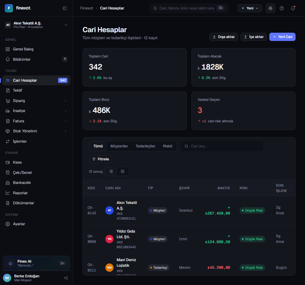
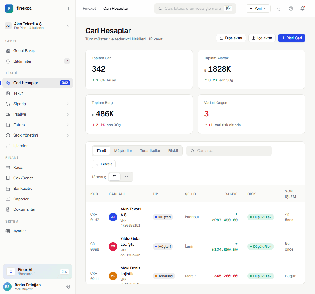
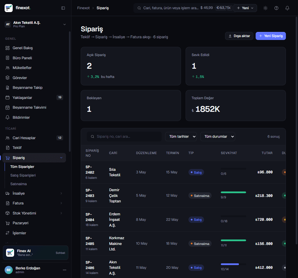
The rebuilt UI ships React 18 + Vite with sub-200ms hot reload during development, a Shadcn-based component library extended for financial UX, and a documented design system that in-house engineers can extend without breaking parity.
Every core workflow — mizan, tax returns, e-invoice, orders, office switcher — was migrated with feature parity, plus new affordances (period picker, dense filters, dark mode) that the old UI couldn't accommodate. The product now feels like enterprise software with startup polish.